
Responsive Design Websites
December 27, 2012

According to Forrester Research, the growth in mobile demand is explosive. In the United States alone, the forecast is for 159 million smart phones to be in use by 2015. More people use smart phones for Internet search than traditional Web (full screen laptops and desktops with browsers). The problem is that your dental website is almost unreadable on a mobile device. So the forward thinking strategy until now had been to develop a separate mobile website that better fits a smaller screen.
Responsive design is a new technique that enables web pages to dynamically adjust depending on the device being used and the amount of screen real estate available. TNT Dental is the only company that I know of that is building responsive design websites in the dental space right now.
An adaptive website thus replaces the need for a separate mobile version of your website. Your TNT website morphs and optimizes with the device you view it on. This enables your mobile site to load faster without the need of a separate site or application. The website identifies the device and its capabilities and decides what is best to load, optimize and change. Because it responds to the device you are using, it is smarter than your average website.
Unlike traditional mobile versions of websites which can be somewhat drab by comparison, the colors and graphics that are part of your regular website are retained and used, so all the work that has gone into creating your unique website are carried throughout the responsive mobile version of your site. It also includes all the optimization from your website which means that all of your on-page SEO remains in place as well.
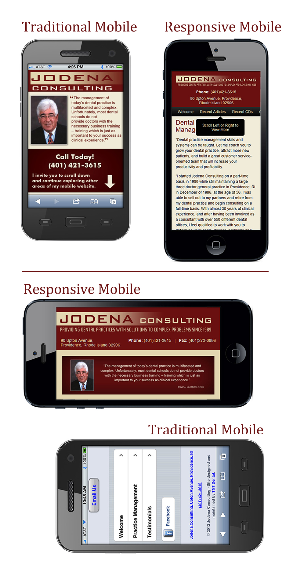
Since a picture is worth a thousand words, my good friends at TNT have created two screen shots to demonstrate how this works. The first shows my website as it would appear on a laptop or desktop computer, an iPad, and a smart phone. In fact the version on the smart phone shows the difference when held horizontally or vertically, demonstrating the ability of responsive design to adapt and optimize to the screen. The second screen shot shows my old (pre-responsive design) basic two page mobile website compared to the new responsive design version.
I think this is SO amazing. You might want to give TNT a call and see if this could work for you. Tim Healy can be reached at 877-868-4932.
No Comments
No comments yet.
RSS feed for comments on this post.
Sorry, the comment form is closed at this time.